
Ops: Six KPI Categories for Process Improvement That Trigger Decisions
Track six KPI categories, no more: speed, quality, throughput, cost, reliability, and people engagement. Pick each metric with one rule in mind: it must inform a decision or trigger an action, not just sit on a dashboard. Formulas, review cadence, and the pitfalls that sink most measurement programs follow below.
TL;DR:
- Focusing only on speed and cost can cause quality deterioration, leading to rework and unexpected expenses.
- Pairing cycle time with first-pass yield or rework rate provides a truthful view of process improvement rather than just faster work.
- Selecting KPIs based on specific, decision-driven questions ensures measurement efforts are relevant and manageable, not just available.
- Automated process discovery tools reveal hidden subprocesses and actual workflows, preventing baselines from being inaccurate due to outdated or incomplete documentation.
- Assigning clear ownership, choosing appropriate cadences, and avoiding metric bloat improve the trustworthiness and actionability of KPI programs.
Table of Contents
- Process KPI categories: a practical framework
- Top KPIs to track for process improvement: formulas, benchmarks, and action triggers
- How to choose the right KPIs for this process
- Measurement and reporting: dashboards, cadence, and governance
- Common pitfalls and how to avoid them
- Practitioner view: process discovery and KPI fidelity
- Author perspective: three practical next steps for the next quarter
- Patterns Process Finder: turning discovery into decision-ready KPIs
- Sources
- FAQ
Process KPI categories: a practical framework
Operations teams that measure well organize their dashboards around six categories, not a scattered list of whatever data happens to be easy to pull. Each category answers a different operational question. Operations leaders who track KPIs well tend to keep two to three metrics per category rather than dozens.
- Speed covers how long work takes from start to finish. Cycle time is a key example that helps inform capacity planning and staffing decisions.
- Quality measures whether output meets standard the first time. First-pass yield is the go-to metric, checked weekly in most operations.
- Throughput tracks volume moved through the process in a given period. Reviewed daily or weekly, it tells you whether a team can absorb more work or needs relief.
- Cost captures what each unit of work costs to produce. Cost per transaction gets reviewed monthly and drives budget and staffing conversations.
- Reliability measures whether the process meets its commitments. SLA attainment and MTTR (mean time to repair) are reliability metrics, typically reviewed weekly.
- People covers the human side, engagement, workload, and turnover risk. eNPS (employee net promoter score) is typically reviewed quarterly due to slower movement.
Skip any category and you get a blind spot. A team that focuses only on speed and cost risks hitting its cycle time target by sacrificing quality, which can lead to unexpected rework and associated costs.
Top KPIs to track for process improvement: formulas, benchmarks, and action triggers
Here’s a working shortlist. Each entry names the formula, whether it’s a leading or lagging indicator, and the management action it should trigger when it moves.
- Cycle time = Total time from start to finish per unit. Lagging. Rising cycle time triggers a workflow audit or staffing review.
- Lead time = Time from request to delivery (includes queue time before work starts). Lagging. A gap between lead time and cycle time signals a queuing problem, not a production problem.
- First-pass yield = Units completed correctly the first time ÷ total units attempted. Leading. A drop below target triggers root-cause review before volume increases.
- Error/rework rate = Units requiring correction ÷ total units processed. Lagging. Pairs with first-pass yield; a rising rate alongside stable yield suggests measurement inconsistency worth investigating.
- Work in progress (WIP) = Units currently in the process but not complete. Leading. Climbing WIP with flat throughput signals a bottleneck upstream.
- Throughput rate = Units completed ÷ time period. Lagging. Falling throughput with stable headcount triggers a capacity or tooling review.
- Cost per transaction = Total process cost ÷ number of transactions. Lagging. Rising cost per unit without a volume drop triggers a cost-driver audit.
- OpEx ratio = Operating expenses ÷ revenue (or output value). Lagging. Used mainly at the portfolio level to compare process investments against returns.
- SLA attainment = Transactions meeting agreed service level ÷ total transactions. Lagging. Sustained attainment below 95% typically triggers a resourcing or process redesign conversation.
- MTTR (mean time to repair/resolve) = Total downtime or resolution time ÷ number of incidents. Lagging. Rising MTTR triggers escalation-path review.
- MTBF (mean time between failures) = Total operating time ÷ number of failures. Leading. Falling MTBF triggers preventive maintenance or root-cause analysis.
- Backlog/open cases = Number of unresolved items at period end. Leading. A growing backlog despite stable throughput signals demand outpacing capacity.
- Manual effort per case = Labour hours ÷ cases handled. Leading. High or rising effort per case is the strongest early signal that a process is a good automation candidate.
- eNPS = % promoters minus % detractors among staff. Leading. A falling score alongside rising throughput often means the team is burning out to hit a target.
- Time savings = Baseline time per unit minus current time per unit, multiplied by volume. Lagging. Used to build the business case for continued investment.
Pro Tip: Never track cycle time without pairing it against first-pass yield or rework rate. A process that gets faster while quality erodes isn’t improving. It’s just failing faster.
That pairing habit matters more than any single metric on the list. Pairing throughput with quality metrics reduces gaming risk and gives you a more honest read on whether a process actually got better or just got measured differently.
How to choose the right KPIs for this process
Start with the decision, not the data you already have. Ask what call the process owner needs to make next month, whether that’s staffing, tooling, or escalation, and work backward to the KPI that answers it. The better practice is picking the decision first and then choosing the metric that supports it, since most teams do the reverse and end up measuring whatever their system happens to export.
Apply SMART criteria (specific, measurable, achievable, relevant, time-bound) to each candidate, then cap your core dashboard at five to seven KPIs. Anything beyond that becomes noise:
- Map each KPI to a specific decision it will inform.
- Separate core dashboard metrics from diagnostic ones you only check when something looks wrong.
- If historical data is patchy, build a baseline from a structured sample of 20 to 30 recent cases or a two-week observation window rather than waiting months for clean data.
- When claiming ROI, separate one-time gains (a backlog cleared once) from recurring, annualized savings, since the two get conflated constantly in business cases.
For attribution confidence, a tiered approach works well: A/B testing where feasible, cohort comparisons when you can’t randomize, and cautious before-and-after analysis with documented confounders when neither is possible.
Measurement and reporting: dashboards, cadence, and governance
Structure the dashboard around five to seven core KPIs plus two or three diagnostic metrics reviewed only when a core number drifts. Assign a named owner to each metric. A number nobody owns is a number nobody fixes.
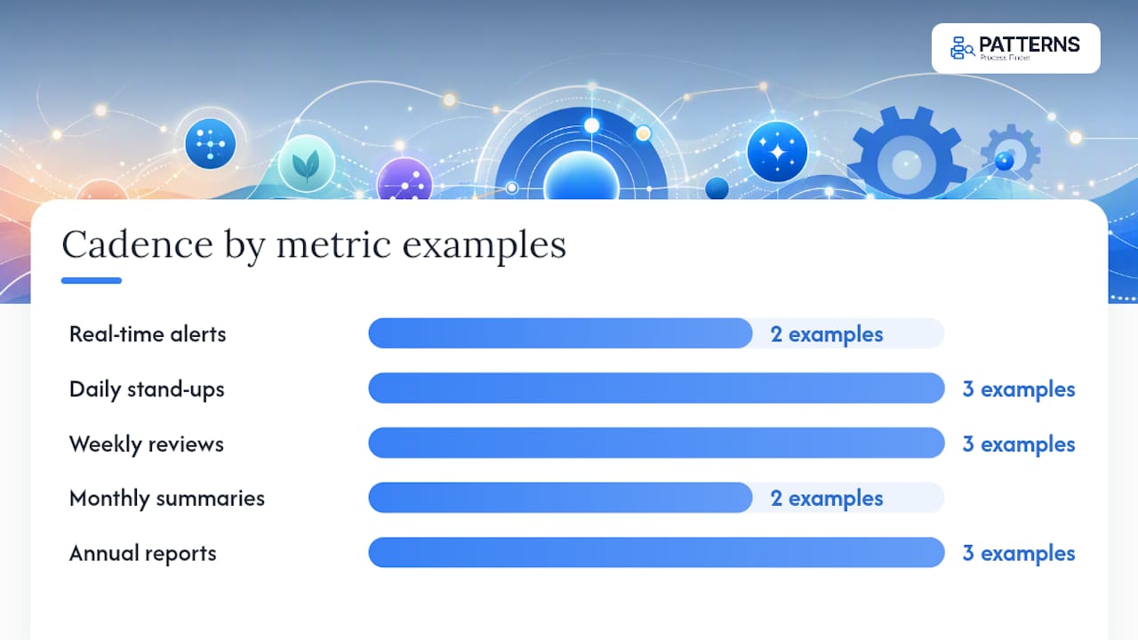
Cadence should vary by metric, not follow one blanket schedule:
- Real-time alerts for SLA breaches and system failures.
- Daily stand-ups for throughput, WIP, and backlog.
- Weekly reviews for cycle time, first-pass yield, and capacity signals.
- Monthly executive summaries for cost per transaction and OpEx ratio.
- Annual aggregate-impact reports rolling up total savings, incidents prevented, and hours reclaimed.
Governance keeps the numbers trustworthy. Write a one-line definition for every metric (what counts as a “case,” what starts the clock on cycle time) and store it next to the dashboard, not in someone’s memory. Build a simple data-quality check into each refresh, and set clear escalation rules for when a metric breaches threshold. On visuals, favour trend lines and traffic-light status over raw totals. A count of “142 tickets closed” means nothing without a rate or a trend attached to it.
Common pitfalls and how to avoid them
Most measurement programs don’t fail from lack of data. They fail from measuring the wrong things well. A systematic review of performance measurement obstacles grouped 175 documented failure points into six categories: system, indicators, people, culture, technology, and data, and indicator design shows up again and again as the weak link.
- Goodhart’s law: any single metric optimized in isolation gets gamed. Pair throughput with quality, and cycle time with rework rate, so improving one at the other’s expense shows up immediately.
- Activity instead of outcome: counting kaizen sessions run or tickets closed tells you nothing about whether the process actually improved. Pair activity counts with an outcome metric like cycle time or cost per unit.
- Siloed departmental KPIs: a team optimizing its own handoff speed can slow the end-to-end process if the next team inherits unfinished work. Map at least one KPI to the full process, not just each department’s slice of it.
- Metric bloat: collecting too many metrics chosen by availability rather than decision-impact is the single most common failure mode. Cut ruthlessly back to what changes a decision.
Pro Tip: If removing a metric from your dashboard wouldn’t change a single decision next quarter, it shouldn’t be on the dashboard this quarter either.
Practitioner view: process discovery and KPI fidelity
Baseline numbers are only as good as the process map behind them. Manual process documentation captures how work is supposed to happen, not how it actually happens, and that gap quietly inflates or deflates every KPI built on top of it. Automated process discovery, the approach behind Patterns Process Finder, records real user actions across desktop and browser applications to surface subprocess variants and exception handling that standard SOPs miss entirely.
One recurring pattern: a team assumes a claims process takes four steps, until discovery shows 30% of cases route through an undocumented exception path that adds two full days. Cycle time baselines built on the “official” process alone would have missed that entirely.
Introduce discovery before setting targets, especially when rework rates don’t match expected volumes. Feed its output straight into your dashboard definitions and governance documentation so every metric traces back to what employees actually do.
Author perspective: three practical next steps for the next quarter
Name your binding constraint this quarter, then choose three KPIs that measure it directly, not six that measure everything loosely. If your system data is unreliable, run a 20 to 30 case sample before setting any target off it. Assign an owner and a cadence to each metric, then commit to one quarterly review that reports aggregate impact, not activity.
— Malek
Patterns Process Finder: turning discovery into decision-ready KPIs
Most KPI programs stall not because teams pick the wrong metrics, but because the baseline underneath those metrics is wrong from day one. Some process mining tools fix that at the source by capturing how work is actually executed, desktop and browser actions included, rather than relying on outdated SOPs or self-reported process steps.
That matters directly for the KPIs in this article. If your cycle time baseline is missing a hidden subprocess, every target you set off it will be wrong before you start, and every automation built on it inherits the same blind spot. Patterns’ process mining capability surfaces those hidden variants and client-specific rules automatically, so your first-pass yield and rework numbers reflect what’s actually happening on the floor, not what the org chart assumes. From there, it generates living SOPs that update as the process changes, so your metric definitions stay accurate instead of drifting out of sync with reality. If your team is setting new KPI baselines this quarter, request a demo to see what discovery reveals about your own numbers.
Sources
- Obstacles to effective performance measurement systems (systematic review)
- KPIs that operations leaders actually track
- Five pitfalls of organizational process metrics
FAQ
What are the five key elements of process improvement?
Most frameworks converge on defining the process, measuring current performance, analyzing root causes of variation, implementing changes, and controlling the new process to sustain gains. KPIs matter most in the measuring and controlling stages.
What are the five main KPIs for process improvement?
A practical core set is cycle time, first-pass yield, throughput rate, cost per transaction, and SLA attainment. Together they cover speed, quality, volume, cost, and reliability without overloading a dashboard.
What are examples of key performance indicators?
Common examples include cycle time, error rate, cost per transaction, MTTR, and eNPS. Each ties to a specific decision, like staffing, quality investment, or budget review, rather than existing as a vanity number.
What are the top three KPIs for a process improvement program?
If you can only track three, pick cycle time, first-pass yield, and cost per transaction. That combination covers speed, quality, and cost, the three levers most process changes actually move.
How does automated process discovery improve KPI accuracy?
Tools like Patterns Process Finder capture real workflow execution instead of documented steps, exposing hidden subprocess variants that otherwise distort cycle time and rework baselines before targets are even set.