
Managers: Fix Team Workflow Metrics with PCE and a 30 Minute Review
Start with process cycle efficiency (PCE) as your headline metric. It tells you what share of total cycle time is real value-adding work versus wait, rework, or approval delay. Pick one workflow this week, measure a baseline, assign an owner, and round it out with a handful of flow, quality, capacity, outcome, and experience metrics reviewed on a fixed weekly cadence.
TL;DR:
- Tracking only activity counts leads to a false sense of productivity; teams need a balanced set of outcome, flow, quality, capacity, and experience metrics.
- Process cycle efficiency is calculated as value-adding time divided by total cycle time, with system timestamps being the most reliable data source.
- Weekly reviews should focus on five to seven leading and lagging indicators, each linked to specific causes and improvements, with clear thresholds and ownership.
- Automated process discovery tools improve measurement accuracy by capturing real user actions and uncovering undocumented subprocess variations that affect metrics.
- Different team types require tailored KPIs, with operational teams focusing on throughput and queue time, while knowledge teams rely more on stakeholder satisfaction and qualitative metrics.
Table of Contents
- Which team workflow metrics should you track first?
- How do you calculate PCE, cycle time and throughput?
- Leading vs lagging indicators: what should you check weekly?
- How do you set thresholds and a review rhythm that drives action?
- What do metric changes usually mean, and what should you fix?
- How does automated process discovery improve metric accuracy?
- How should workflow metrics differ across team types?
- What do these metrics look like in practice?
- Why do numbers alone miss half the story?
- A 90-day plan for adopting this
- A practical next step: automated discovery for teams tracking these metrics
- Sources
- FAQ
Which team workflow metrics should you track first?
Most teams fail at measurement not because they track too little, but because they track the wrong mix. A dashboard full of activity counts tells you people are busy. It says nothing about whether work is moving, whether quality is holding, or whether the team can absorb more without breaking.
The fix is a balanced framework across five categories: outcome, flow, quality, capacity, and experience. Each category answers a different question, and skipping one lets the others drift unchecked. Optimizing purely for speed causes quality to erode. Optimize purely for quality and throughput stalls. This is the same logic behind operational efficiency frameworks that categorize metrics into speed, quality, and risk rather than letting one dominate.
Here’s what each category covers, with three sample KPIs apiece:
- Outcome metrics measure whether the work delivered the result the business needed: on-time delivery rate, customer-impact score, revenue or cost tied to the process.
- Flow metrics track how work moves through the system: process cycle efficiency, cycle time, throughput per week.
- Quality metrics catch defects and rework before they compound: rework rate, error/defect rate, first-pass yield.
- Capacity metrics watch whether the team has room to take on more or is already stretched: utilization rate, work-in-progress (WIP) per person, overtime hours.
- Experience metrics cover how the work feels to do and to receive: customer satisfaction (CSAT), employee engagement pulse scores, internal stakeholder satisfaction.
For any single workflow, pick five to seven KPIs total, drawn across at least three of those categories, and tie each one explicitly to a business outcome. A support team measuring only response time (flow) while ignoring resolution quality is optimizing for a number that looks good in a report and terrible in a customer’s inbox. The discipline is choosing few enough metrics that a weekly review stays focused, but enough categories that no blind spot goes unwatched.
If you’re unsure which workflow to instrument first, treat it as a prioritization problem before a measurement one. Frameworks like RICE and MoSCoW exist for exactly this decision when a backlog of candidate workflows is competing for attention.
How do you calculate PCE, cycle time and throughput?
Process cycle efficiency is the calculation that separates real progress from busywork. The formula is simple:
PCE = Value-Adding Time ÷ Total Cycle Time
Value-adding time is the portion of the process that directly transforms the work, the steps a customer would pay for if they saw them itemized: drafting, coding, reviewing for content, building. Total cycle time is everything, including queues, approvals, handoffs, and waiting on someone else’s calendar. Teamwork’s guidance on workflow efficiency recommends PCE precisely because it exposes wait states and rework that a raw cycle-time number hides.
Say a contract review takes 10 business days start to finish, but the lawyer is only actively working on it for 6 hours across those 10 days.
| Metric | What it measures | Typical data source |
|---|---|---|
| PCE | Value-adding time ÷ total cycle time | Timestamps from task tools, manual time logs |
| Cycle time | Start to finish elapsed time for one unit of work | Ticket/task system timestamps |
| Throughput | Units completed per period | Task or ticket completion counts |
| Queue time | Time a task sits waiting, untouched | Status-change timestamps |
| Blocked-work ageing | How long an item has sat in a blocked state | Status logs, flagged fields |
The biggest pitfall is relying on human estimates instead of system timestamps. People consistently underestimate how long something actually sat idle, and self-reported time logs tend to round toward whatever looks reasonable. Automated timestamp capture from tools and system logs is far more reliable than manual reporting, and it’s the only way to catch queue time that nobody remembers happening. A second pitfall: inconsistent definitions across teams. If “cycle time” starts at request submission for one team and at work assignment for another, your cross-team comparisons are meaningless before you even begin.
Leading vs lagging indicators: what should you check weekly?
A lagging indicator tells you what already happened. A leading indicator tells you what’s about to happen, while you can still do something about it. The distinction matters because most dashboards are stuffed with lagging metrics that arrive too late to influence, dressed up to look like management tools.
The operational test for a true leading indicator: can the team influence it within one to two weeks? If the answer is no, it’s lagging, no matter how current the data feels. Amplitude’s framework on leading and lagging indicators puts this bluntly, and it notes something managers often miss: the same metric can be lagging relative to one outcome and leading for another. Cycle time is lagging against “did we ship the release,” but leading against “will we hit next month’s throughput target.”
A short, validated set of leading measures to track weekly:
- Cycle time trend (is it rising or falling week over week, not just the raw number)
- Blocked-work ageing (how many items have sat blocked more than 48 hours)
- Backlog readiness (percentage of upcoming work that’s actually scoped and unblocked)
- WIP per person (a rising number here usually predicts a cycle-time spike two weeks out)
- Decision turnaround time (how long approvals or sign-offs take once requested)
Amplitude’s own guidance suggests tracking five to seven leading indicators per outcome, not more. The same source is worth citing again here because the ceiling is deliberate: past that count, weekly reviews turn into status theatre instead of decision-making.
Pro Tip: Pair every quantity-based leading indicator with a quality counterpart. If you track throughput alone, someone will hit the number by rushing and pushing defects downstream. Track throughput next to rework rate, and the gaming stops making sense.
How do you set thresholds and a review rhythm that drives action?
Metrics without a decision rule are just numbers on a screen. The fix is threshold bands and a fixed weekly meeting that ends in one action per metric that has moved.
Start by setting a baseline over two to four weeks before locking any target. A realistic first target is a moderate PCE improvement over a quarter, based on the same workflow measurement guidance that recommends this baselining window. Chasing a bigger jump in month one usually means someone is manipulating the input data rather than fixing the process.
- Set baselines first. Measure for two to four weeks before setting any target, then lock a green/amber/red band around it.
- Define green, amber, red concretely. Green means the metric is at or above target with no action needed. Amber means a 10% deviation triggers a documented cause and a watch period. Red means the owner presents a corrective action at the next review, no exceptions.
- Assign one owner per metric. Not a team, not a department. One named person accountable for explaining movement and proposing the fix.
- Run a 30-minute weekly review. Five minutes per metric: current status, cause if amber or red, and the one action being taken. No open-ended discussion.
- Close every review with logged actions, not just observations. A manager-run weekly rhythm built around one corrective action per metric moves outcomes faster than reporting-only reviews, because it forces a decision instead of a status update.
What do metric changes usually mean, and what should you fix?
Metrics only earn their keep when a specific movement points to a specific fix. Guessing at causes wastes the review time you just built into the calendar.
Long queue time almost always traces to one of two things: an approval gate with a single bottleneck reviewer, or a task with no clear owner sitting in a shared inbox. Check who touched the item last and how long it sat before that. Rising WIP per person usually means someone said yes to too much new work before finishing what’s in flight, often because there’s no visible limit on how many items one person can hold. A falling PCE with a flat cycle time is a signal that rework is creeping in even though nothing looks slower on the surface.
Match the diagnosis to a single corrective action, not a redesign:
- Long queue time at an approval step → simplify the approval (fewer sign-offs, or a delegated threshold below which no approval is needed).
- Rising WIP per person → cap work-in-progress explicitly and hold the line for two weeks.
- High blocked-work ageing → assign a daily “unblock owner” whose only job that week is clearing stuck items.
- Frequent handoffs inflating cycle time → batch similar tasks so one person completes a full segment instead of passing it three times.
- Rework rate climbing → protect uninterrupted focus blocks for the step where errors originate.
Run the fix for one to two weeks, then check the same metric again before declaring success. If it hasn’t moved, you diagnosed the wrong cause, and the review process should surface that quickly rather than let the same fix limp along for a quarter.
How does automated process discovery improve metric accuracy?
Most PCE and queue-time numbers are wrong before anyone runs a calculation, not because the math is off but because the inputs are guesses. Teams document how a process is supposed to work, then measure against that document while employees quietly route around it with workarounds, exceptions, and client-specific rules nobody wrote down.
Automated process discovery closes that gap by capturing what people actually do. Some automated process discovery tools record real user actions across desktop and browser applications, surfacing hidden subprocess variations and exception patterns that standard documentation never mentions. That matters directly for measurement: you cannot calculate accurate value-adding time if your map of the process is fictional.
The gap between “how work is supposed to happen” and “how work actually happens” is exactly where PCE calculations go wrong. Measure the documented process and you get a clean number that describes nothing real.
For teams with high automation failure rates or workflows that keep breaking in production, this kind of discovery does two concrete things: it produces more accurate cycle-time and PCE baselines because the underlying map reflects reality, and it speeds root-cause work because living SOPs update automatically instead of going stale the week after someone documents them.
How should workflow metrics differ across team types?
A five-person creative team and a forty-person claims-processing unit cannot run the same metric set, even though both benefit from the outcome/flow/quality/capacity/experience structure. The categories stay fixed. The specific KPIs inside them change.
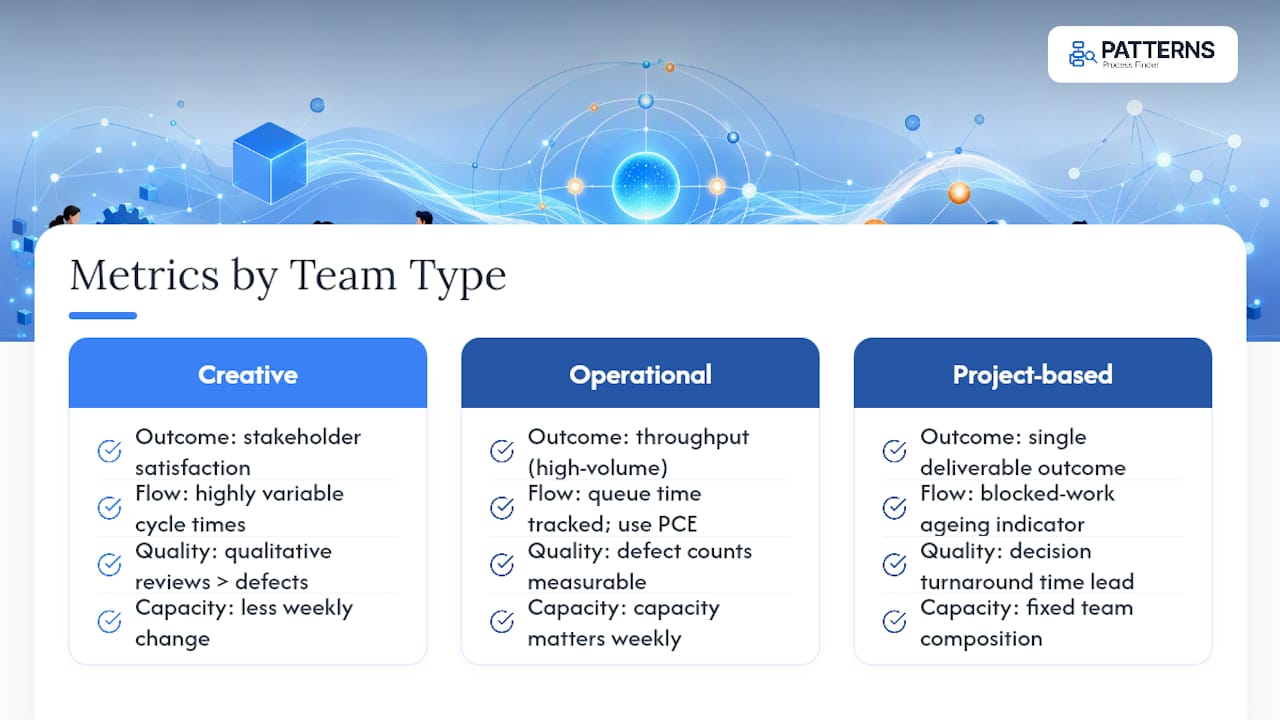
Creative and knowledge-work teams tend to have highly variable cycle times, so tracking a single average cycle time misleads. Quality metrics for this group often lean qualitative: stakeholder satisfaction with a deliverable matters more than a defect count.
High-volume operational teams, like claims processing or support ticketing, are the opposite. Throughput and queue time are highly meaningful because the work is repetitive and comparable unit to unit. PCE is especially powerful here because approval gates and handoffs are usually the dominant source of waste, and they’re measurable with precision.
Project-based teams working on one deliverable at a time, like a software release or a client onboarding, benefit most from blocked-work ageing and decision turnaround time as leading indicators, since a single blocked dependency can stall the entire outcome. Capacity metrics matter less week to week for this group, since the team’s composition is usually fixed for the project’s duration.
The rule that holds across all three: choose KPIs the team can actually influence, and drop any metric nobody on the team can name a cause for when it moves.
What do these metrics look like in practice?
Almost all the elapsed time was queue time in a single approval step where one manager reviewed every invoice regardless of amount. The fix wasn’t more staff; it was a delegated approval threshold below $5,000. Queue time at that step dropped within two weeks, and PCE climbed without touching headcount.
A software team noticed throughput climbing steadily for a month while customer-reported bugs rose in parallel. Throughput alone looked like a win. Paired with rework rate, the real story was rushed output. The corrective action was a WIP cap per developer, and rework rate fell the following sprint while throughput stayed roughly flat, meaning the earlier “growth” had been partly fictional.
A customer support team monitoring collaboration signals, handoff delays between tiers and decision turnaround time on escalations, cut average resolution cycle time meaningfully within two quarters simply by watching those two leading indicators weekly. That kind of result lines up with what Teamwork’s research on team performance metrics has found among teams that track handoff and decision-cycle signals specifically rather than aggregate resolution time alone.
None of these fixes required new headcount or a system overhaul. Each one came from a metric signal pointing at a specific, small change.
Why do numbers alone miss half the story?
Quantitative data shows what happened. It rarely explains what it cost to get there or whether the improvement will hold.
This is where qualitative input earns its place next to the dashboard, not as a soft addition but as a check against gaming and false signals. A quick weekly pulse question, “what slowed you down this week that the numbers won’t show,” catches problems before they show up as a metric movement two weeks later. Engagement dips often precede quality drops by a cycle or two, giving you an early warning that a purely quantitative system misses.
The two work best paired directly to the review rhythm. When a metric moves into amber, ask the owner not just what the number says but what people closest to the work observed. A rising rework rate paired with a comment like “we’re skipping the review step to hit the deadline” tells you the actual cause in one sentence, faster than any amount of log analysis. Treat qualitative feedback as a diagnostic tool with the same standing as a dashboard, not as a nice-to-have appendix to the real data.
A 90-day plan for adopting this
In week one, map a single workflow and capture a baseline for PCE and cycle time using real timestamps, not estimates. Across weeks two through four, settle on three to five outcome anchors and five to seven leading indicators, assign a named owner to each, and start the 30-minute weekly review. By the end of quarter one, you’re not just tracking numbers, you’re iterating on which indicators actually predicted trouble, tightening thresholds, and confirming ownership held up under real pressure. The system that survives quarter one is the one worth keeping past it.
— Malek
A practical next step: automated discovery for teams tracking these metrics
If you’ve made it this far, you already know the hardest part of measuring workflow performance isn’t the formula. It’s getting an accurate picture of what the process actually looks like before you calculate anything. Certain automated process discovery tools are built for exactly that gap: capturing real user actions across desktop and browser tools, surfacing subprocess variants and exception rules teams build to cope with reality, and turning that into living SOPs that update as the work changes.
For operations leads, automation developers, and business analysts running the kind of weekly review this article describes, that means your PCE and queue-time baselines are built on what people actually do, not what a document from two years ago claims they do. A demo typically walks through capturing one live workflow and showing where the hidden variation sits. Plans run on a Basic, Pro, and Enterprise structure depending on deployment scale, and you can request a demo to see how it maps against a workflow you’re already trying to fix.
Sources
For deeper method detail, APQC’s process performance metrics cover benchmarked cycle-time standards. Teamwork’s workflow efficiency guide walks through PCE in more depth, and Amplitude’s leading versus lagging framework explains indicator selection. For automated discovery, see Patterns Process Finder.
- Workflow Efficiency: What It Is and How to Improve It — Teamwork
- Leading and lagging indicators — Amplitude
FAQ
What are the 5 KPIs of a team leader?
There’s no single fixed list, but a balanced set typically pulls one KPI each from outcome, flow, quality, capacity, and experience categories, such as on-time delivery, cycle time, rework rate, utilization, and team satisfaction. The exact KPIs should tie to the specific workflow and business outcome a leader is accountable for.
What are team performance metrics?
Team performance metrics are the quantitative measures leaders use to track how well a team delivers work, spanning speed (cycle time, throughput), quality (rework rate, defect rate), and capacity (utilization, WIP). The strongest frameworks combine several categories rather than relying on one number, since optimizing for speed alone tends to erode quality or margin.
What are 5 examples of metrics to measure performance?
Five commonly used metrics are process cycle efficiency, cycle time, throughput, rework rate, and customer satisfaction (CSAT). PCE is often recommended as the starting metric because it isolates active work time from wait states that inflate cycle time without adding value.
What are some effective KPIs for a team?
Effective team KPIs are specific, influenceable within a week or two, and paired so quantity metrics can’t be gamed without a quality metric catching it, for example throughput tracked alongside rework rate. Leading indicators like blocked-work ageing and decision turnaround time work best because teams can act on them immediately rather than only reviewing them after the fact.
How can automated process discovery help with tracking these metrics?
Automated discovery tools like Patterns Process Finder capture what employees actually do rather than the documented version of a process, which improves the accuracy of PCE and cycle-time baselines. This matters most for teams with high automation failure rates or workflows with a lot of undocumented variation, where the gap between the SOP and real execution is largest.
Recommended
- Turn Everyday Work Into Living SOPs | Automated Documentation Tool
- Process Mining Tool for Business Analysts, Unlock Insights with AI | Sign Up for Free
- Derive, Diff, Serve: How Ops Teams Build Living Process Documentation | Patterns AI Blog
- Decide When to Automate a Process: Six Signs and a Scoring Matrix | Patterns AI Blog