
CFO ready digital transformation metrics across four KPI domains
Track four KPI domains: operational efficiency, customer engagement, workforce adoption, and new sources of value. No single metric proves transformation success on its own. The discipline that separates credible programs from guesswork is simple: document a baseline before you launch anything, pair leading indicators with lagging ones, and tie every number to a time-to-value or ROI target a CFO would recognize.
TL;DR:
- Document a baseline for each KPI over 60 to 90 days before setting targets, ensuring measurement accuracy despite employee workarounds or exceptions.
- Assign clear ownership and define measurement methods explicitly to prevent disagreements and improve data reliability early in the program.
- Focus on impact versus measurability when selecting KPIs, prioritizing high-impact, data-robust metrics for meaningful governance.
- Use a range of ROI scenarios to reflect initiative type, with shorter projects like automation reaching value within weeks and enterprise programs taking up to two years.
- Supplement quantitative KPIs with qualitative feedback and review both regularly to identify hidden issues and build trust in transformation progress.
Table of Contents
- Digital transformation metrics that matter across every KPI domain
- How to choose the right KPIs for your transformation program
- Measuring ROI and setting realistic time-to-value expectations
- Leading indicators predict outcomes; lagging indicators confirm them
- Setting targets that hold up under scrutiny
- Building executive dashboards and setting review cadence
- The measurement mistakes that quietly sink transformation programs
- Why accurate baselines start with how work actually happens
- Your next 30 to 90 days
- Why numbers alone don’t tell the whole transformation story
- What the data actually supports, and what gets oversold
- Sources
- FAQ
Digital transformation metrics that matter across every KPI domain
IMD’s taxonomy organizes 24 metrics across four categories, and it’s the clearest map available for building a scorecard that doesn’t miss a blind spot. Deloitte reaches a similar conclusion from a different angle, warning that internal efficiency metrics alone flatter a program while customer and value metrics stay flat or worse.
Here are the KPIs worth tracking in each domain, with how to measure them and where public benchmarks give you a target range.
- Cycle time — the elapsed time from process start to finish. Measure it with timestamped event logs, not manager estimates. A claims process can often be shortened significantly once bottleneck steps are isolated.
- Cost per transaction — total processing cost divided by transaction volume. If a manual invoice cycle costs $18 per invoice and automation drops it to $6, a 10,000 invoice month saves $120,000, a number that lands cleanly on a finance dashboard.
- Automation coverage — the share of eligible process steps actually running through automation rather than manual workaround. Track this monthly; a coverage rate that plateaus below 60% usually signals unresolved exceptions, not lack of ambition.
- Adoption rate — the percentage of intended users actively using the new tool or process at 30, 60, and 90 days.
- Customer satisfaction (CSAT) — post-interaction survey score, typically measured on a 1-5 scale immediately after a transaction or support ticket.
- Net Promoter Score (NPS) — a single-question loyalty measure tracked quarterly to catch trend shifts before churn shows up in revenue.
- Digital revenue share — the percentage of total revenue flowing through digital channels versus legacy ones.
- Error rate / exception rate — the share of transactions requiring manual rework or correction.
- Time-to-value — the elapsed period between go-live and the first measurable business benefit.
- Employee engagement score — pulled from pulse surveys tied specifically to the new tools or workflows, not generic HR sentiment.
Pro Tip: Don’t average CSAT and NPS into one blended “customer happiness” number. They measure different things, one transactional, one relational, and blending them hides which lever actually needs attention.
How to choose the right KPIs for your transformation program
Most measurement programs fail before they start because teams pick metrics that sound impressive rather than ones they can actually govern. Fix that with a five-step selection process.
- Collect a documented baseline first. Give this 60 to 90 days to smooth out seasonal noise and one-off anomalies before you set a target against it.
- Assign a single owner per KPI. A metric with two owners has none. Name the person accountable for the number, not the department.
- Define the measurement method in writing. State exactly which system, timestamp, and calculation produces the figure, so nobody argues about it in month six.
- Split your KPIs into tiers. Reserve three to five for executive reporting and keep a broader operational set, generally 8 to 12 active KPIs total, for the delivery team.
- Score candidates on impact versus measurability. A KPI with high business impact but poor data quality needs a fix before it earns a spot on the dashboard; a KPI that’s easy to measure but low-impact doesn’t deserve the reporting effort.
Gartner’s Digital Execution Scorecard backs this structure directly, recommending common measurements, clear ownership, and repeated assessment cycles as the mechanism that keeps stakeholders aligned on progress rather than arguing about whose number is right.
Pro Tip: Build your decision matrix on a simple two-axis grid: impact on one side, measurability on the other. Anything that lands in the high-impact, low-measurability quadrant is worth fixing your data pipeline for before you commit it to a dashboard.
Measuring ROI and setting realistic time-to-value expectations
ROI on a digital transformation initiative follows a formula finance teams already trust: (Total Benefits − Total Costs) ÷ Total Costs, expressed as a percentage. The credibility problem isn’t the formula, it’s what goes into each side of it.
Costs should include software licensing, implementation services, training hours, and the labour required to run change management, not just the sticker price of the platform. Benefits should include labour capacity created (not necessarily headcount cut), error-reduction savings, revenue lift from faster cycle times, and working-capital improvements from shorter processing windows. A practical ROI model built around this expanded benefit list, including labour, error reduction, revenue lift, and working-capital effects, gives finance a number they can actually defend to the board.
Time-to-value varies sharply by initiative type:
| Initiative type | Typical time-to-value |
|---|---|
| Narrow workflow automation | 4 to 8 weeks |
| AI copilot or assistant deployment | 2 to 4 months |
| Platform modernization | 6 to 12 months |
| Enterprise-wide transformation program | 12 to 24 months |
Present three scenarios, conservative, expected, and upside, rather than a single number. A single ROI figure invites skepticism; a range with stated assumptions invites trust. For CFO reporting specifically, keep the scorecard tight: one primary financial metric, two operating metrics, and one adoption or risk metric. Anything more dilutes the story.
- Include software, services, training, and labour on the cost side.
- Include error-reduction savings, revenue lift, and working-capital impact on the benefit side.
- Where software delivery drives time-to-value, standard delivery metrics like deployment frequency and change failure rate remain useful supporting inputs.
Leading indicators predict outcomes; lagging indicators confirm them
A leading indicator moves before the business result shows up. A lagging indicator confirms whether it actually worked. Adoption rate at day 30 is leading; digital revenue share six months later is lagging. Watch leading indicators weekly during rollout, because a dip there gives you weeks of runway to correct course before the lagging KPI drops.
Five early-warning metrics worth putting on a weekly cadence:
- Adoption rate at day 30 and again at day 90.
- Data quality score on the inputs feeding automated steps.
- Automation exception rate (flagged when it climbs past 5%, a signal to pause scaling and fix root causes first rather than push more volume through a broken process).
- Active user ratio versus licensed or provisioned users.
- Support ticket volume tied specifically to the new workflow.
Setting targets that hold up under scrutiny
Percent-improvement targets work best for mature processes with a stable baseline; absolute targets work better for new capabilities with no prior comparison point. Don’t default to one style out of habit, match it to what you’re actually measuring.
Credible benchmarks come from named sources, not vague industry folklore. Gartner’s scorecard and IMD’s KPI taxonomy both publish structured benchmarks you can adapt, but adjust any external figure for your company’s size, sector, and starting maturity before adopting it as a target.
Use three time horizons when setting targets:
- 90 days — early adoption and data-quality signals, not financial results yet.
- 12 months — measurable operating outcomes: cycle time, error rate, customer engagement shifts.
- Three years — full ROI realization, including working-capital and revenue effects that take longer to materialize.
Building executive dashboards and setting review cadence
Keep the executive layer at three to five KPIs, reviewed monthly or quarterly, and let the operational layer carry 15 to 20 metrics reviewed weekly or monthly by the delivery team. For deeper insight, consider using sales engagement analytics to guide your executive dashboards and ongoing performance reviews. Mixing the two into one dashboard is how steering committees end up debating cycle-time variance instead of strategy.
- Weekly: operations team reviews leading indicators and exception rates.
- Monthly: program leadership reviews the full operational set against baseline.
- Quarterly: steering group reviews the executive scorecard against the business case.
Every dashboard slide should show four things: the trend line, the baseline it started from, the variance against target, and a short narrative on root cause when the number moves. A number without a trend is a snapshot; a number without a root-cause note invites the wrong question in the room.
The measurement mistakes that quietly sink transformation programs
MIT Sloan’s research makes the core failure mode plain: KPIs built around delivery milestones, went live on time, migrated X systems, reward activity, not business outcomes. A program can hit every milestone and still fail to move revenue, cost, or customer experience.
Three fixes address most of this:
- Document a baseline before claiming any improvement percentage.
- Cut your active KPI list; 8 to 12 is a ceiling, not a starting point to build toward.
- Link every KPI explicitly to a P&L line item, revenue, cost, or working capital, so a “green” dashboard actually means something financially.
Pro Tip: Run a quick verification check on your KPI list: for each one, can you name the owner, the exact data source, and the P&L line it’s supposed to move? If any answer is “not sure,” that KPI isn’t ready for a dashboard.
Why accurate baselines start with how work actually happens
Most baseline numbers are wrong before measurement even starts, because they’re built on documented procedure, not actual behaviour. Employees build workarounds, skip steps, and invent local exceptions that never make it into an SOP, and every one of those gaps shows up later as an automation failure or an inflated exception rate.
Reality-based process capture, watching how work is actually executed across desktop and browser tools, closes that gap before it costs you a rebuild. Patterns Process Finder records genuine workflows rather than the official version, surfacing hidden subprocess variations and client-specific rules that traditional documentation misses entirely.
The gap between “how work is supposed to happen” and “how work actually happens” is exactly where automation projects lose money, in exception rates nobody predicted and rework nobody budgeted for.
That accuracy compounds.
Your next 30 to 90 days
Pick three executive KPIs, one from operations, one from customer engagement, one tied to new value creation, and start collecting a documented baseline immediately; give it 60 to 90 days minimum. Assign a named owner and written measurement method to each before reporting begins.
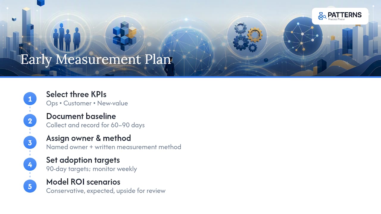
Set 90-day adoption targets and monitor them weekly, not monthly. Model conservative, expected, and upside ROI scenarios now, using the cost and benefit categories outlined above, and bring that model to your next steering group review as the basis for continued funding rather than a retrospective justification.
Why numbers alone don’t tell the whole transformation story
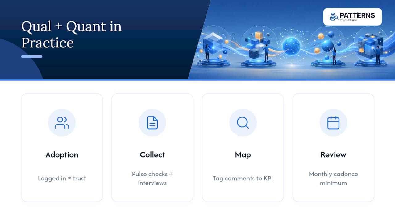
A dashboard full of green KPIs can still describe a program employees quietly hate using. Adoption rate tells you someone logged in; it doesn’t tell you whether they trust the new process enough to stop running a shadow spreadsheet beside it. That gap is exactly where qualitative feedback earns its place next to the quantitative scorecard.
Pair structured surveys, short pulse checks after major releases work better than annual engagement surveys, with open-ended interview data from the teams closest to the workflow. Support ticket themes, help desk call transcripts, and manager one-on-ones often surface a root cause weeks before it shows up as a dip in CSAT or a spike in exception rate.
The practical method: tag qualitative input against the same KPI categories you’re already tracking. A cluster of complaints about “too many clicks” maps directly to cycle time. Frustration with unclear error messages maps to your exception rate and data quality score. This turns anecdote into something a dashboard can actually absorb, rather than treating survey comments as a separate, softer category of evidence.
Review qualitative themes at the same cadence as your operational metrics, monthly at minimum, so a shift in sentiment gets investigated before it becomes a lagging KPI problem. Numbers confirm what happened. Conversations usually explain why.
What the data actually supports, and what gets oversold
Most transformation guidance treats measurement as an afterthought, something you bolt on after the platform goes live to justify the budget already spent. That sequencing is backwards, and it’s why so many programs can’t answer a simple board question: what did this actually buy us?
The uncomfortable truth is that most failed measurement programs weren’t undone by bad KPIs. They were undone by baselines nobody bothered to document, which made every improvement claim afterward unverifiable. Deloitte and IMD both push toward broader KPI taxonomies, and that’s sound advice, but breadth without a documented starting point just produces more numbers you can’t trust.
The other overrated idea is precision. Leadership teams chase a single definitive ROI figure when a conservative-to-upside range, tied to named cost and benefit categories, holds up far better under scrutiny. If you do only one thing differently after reading this: fix your baseline discipline before you touch your KPI count. Everything downstream, targets, dashboards, ROI credibility, depends on that one decision more than any framework you adopt afterward.
— Malek
Sources
- Mapping Digital Transformation Value
- A taxonomy of 24 digital transformation KPIs
- Gartner Digital Execution Scorecard™
- How the wrong KPIs doom digital transformation
FAQ
What are the most important digital transformation metrics to track?
The core set spans four domains: operational efficiency (cycle time, cost per transaction), customer engagement (CSAT, NPS), workforce adoption (adoption rate, engagement score), and new value creation (digital revenue share).
How long should you collect a baseline before setting targets?
Most practitioners recommend 60 to 90 days of baseline data collection before setting improvement targets, long enough to smooth out seasonal variation without delaying the program.
What’s the difference between leading and lagging indicators in digital transformation?
Leading indicators, like adoption rate or data quality score, move before a result appears and let teams correct course early; lagging indicators, like digital revenue share or NPS, confirm whether the change actually worked.
How many KPIs should a transformation program actively track?
Keep the executive dashboard to three to five KPIs and the broader operational set to 8 to 12 active KPIs; beyond that range, reporting burden usually outweighs the insight gained.
What time-to-value should leaders expect from a digital transformation initiative?
Narrow workflow automation often shows value in 4 to 8 weeks, AI copilots in 2 to 4 months, platform modernization in 6 to 12 months, and enterprise-wide programs in 12 to 24 months.